
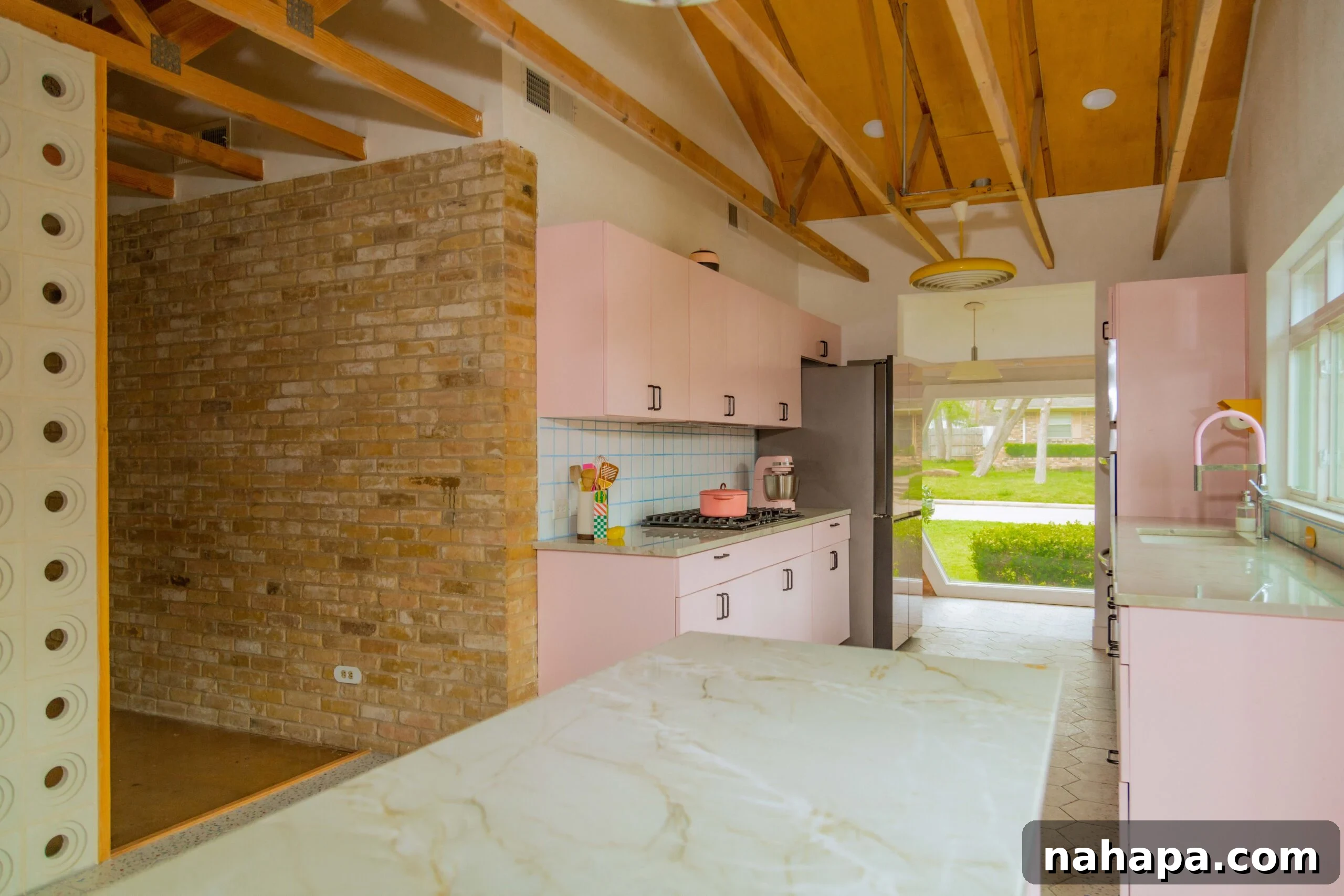
Welcome to an exclusive tour of our vibrant pink mid-century modern kitchen, a space meticulously designed to be both a functional powerhouse for a food blogger and a warm, inviting heart of our home. This isn’t just a kitchen; it’s a testament to personalized design, a blend of nostalgic charm with contemporary efficiency, and a place where culinary creativity truly flourishes. Prepare to be inspired by the unique aesthetic, smart storage solutions, and design choices that encapsulate the spirit of mid-century modern living with a playful, colorful twist.

My husband and I have always shared a profound appreciation for mid-century modern design. It’s not just about the iconic furniture or the clean lines; it’s about the era’s philosophy of bringing innovative, functional, and aesthetically pleasing design into everyday life. Coupled with our love for vibrant colors and the desire to infuse every corner of our living space with our unique personal touch, we harbored a long-standing dream of remodeling or even designing our own home from scratch. Yet, for years, we found ourselves settling for ‘flipped’ houses – properties that, while updated, often lacked the distinct character and soul we craved.
The turning point arrived unexpectedly in the spring of 2022. My husband received a real estate email, an intriguing listing for a house with no accompanying photos. His curiosity piqued, he delved deeper, and to our astonishment, he unearthed a hidden gem: a cool, custom-built home from 1975, perfectly nestled in our desired neighborhood. Upon seeing it in person, the scale of the undertaking became clear; it needed a considerable amount of work. However, the house’s inherent charm and potential spoke to us, igniting a readiness to embrace the challenge and transform it into our dream mid-century modern oasis.
As a food blogger, the kitchen naturally became the epicenter of my creative vision and the primary focus of our renovation efforts. It’s where I spend countless hours working, developing recipes, and capturing content. We poured all our energy, passion, and design ideas into creating a space that not only reflected our aesthetic preferences but also functioned flawlessly for my professional needs. The result is a kitchen we both deeply adore – a perfectly functional, inspiring, and uniquely personalized workspace that stands as a testament to our vision and dedication.
BEFORE: A Glimpse into the Past
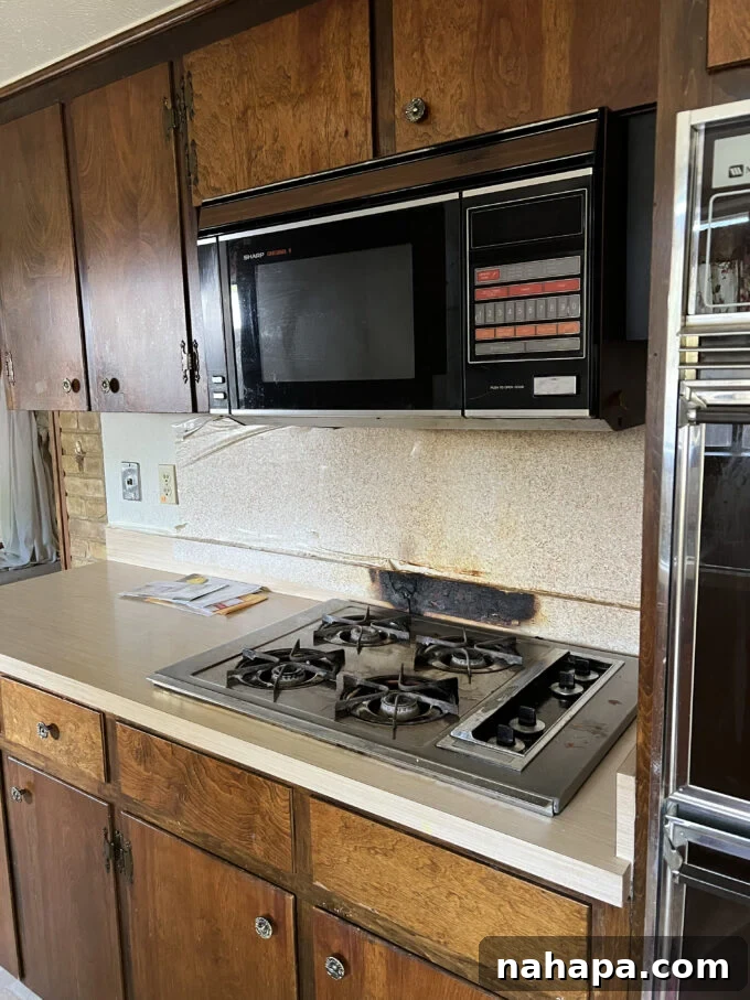
To truly appreciate the transformation, it’s essential to understand where we started. The “before” photos, captured in July 2022, reveal a kitchen that was a stark contrast to our mid-century modern aspirations. The space was dominated by a low, oppressive drop ceiling, which severely constrained the verticality and made the entire room feel uncomfortably tight and dated. The existing cabinetry was old, worn, and lacked any distinctive style, contributing to the kitchen’s overall uninspired aesthetic. Perhaps most indicative of its previous life was a rather unfortunate burnt peel-and-stick backsplash – a clear sign that quick fixes had previously taken precedence over thoughtful design.
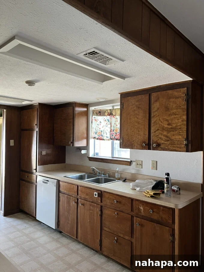
Every element in the original kitchen screamed “outdated,” presenting a clear canvas for our ambitious renovation. The materials were cheap, the layout was inefficient, and the overall ambiance was far from the bright, open, and creatively stimulating environment we envisioned. It was a space that had served its purpose, but it was now ripe for a complete overhaul, ready to shed its past and embrace a vibrant new identity.
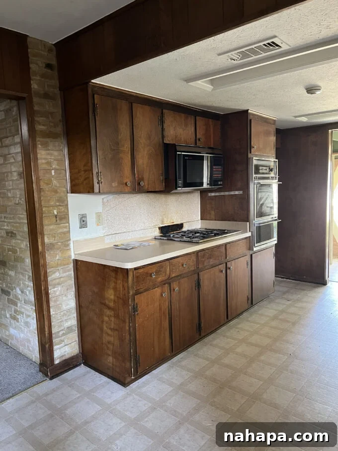
The dark corners and lack of natural light were significant challenges we aimed to address. The existing windows were small and did little to invite the outside in, further contributing to the enclosed feel of the room. This lack of light was a major hurdle, especially for my photography needs as a food blogger, making the transformation of light and space a top priority in our design plan.
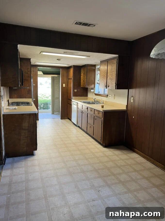
From the tired flooring to the dingy walls, every surface begged for a refresh. The kitchen felt disconnected from the rest of the house, lacking the cohesive flow and inviting atmosphere that a mid-century modern home truly embodies. We knew that a complete gut renovation was necessary to achieve the open, airy, and vibrant space we dreamed of.
AFTER: A Radiant Mid-Century Modern Pink Kitchen Oasis
The “after” transformation is nothing short of a complete metamorphosis. We embarked on a full-scale renovation, literally stripping the kitchen down to its studs. One of the most impactful changes was opening up the ceiling, eliminating the restrictive drop ceiling to create a soaring, expansive space that immediately felt larger and more inviting. We replaced literally everything from top to bottom: walls, custom pink cabinets, high-efficiency appliances, and significantly larger windows. Our overarching goal was to craft a truly unique and inspiring space – not just for everyday living, but specifically tailored for my work, enabling me to efficiently create high-quality content for all of you.
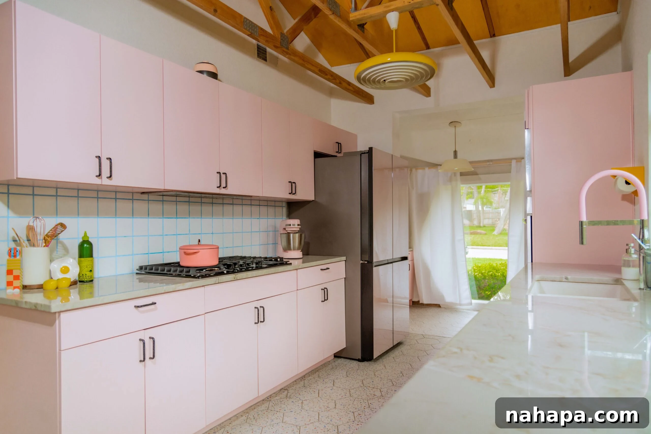
The new kitchen radiates a fresh, contemporary mid-century modern vibe while embracing a playful pink palette. The open shelving, sleek lines, and thoughtful lighting contribute to an airy, uncluttered feel. Each design choice was made with intention, balancing aesthetic appeal with practical functionality, creating a kitchen that is both a visual delight and a highly efficient workspace.
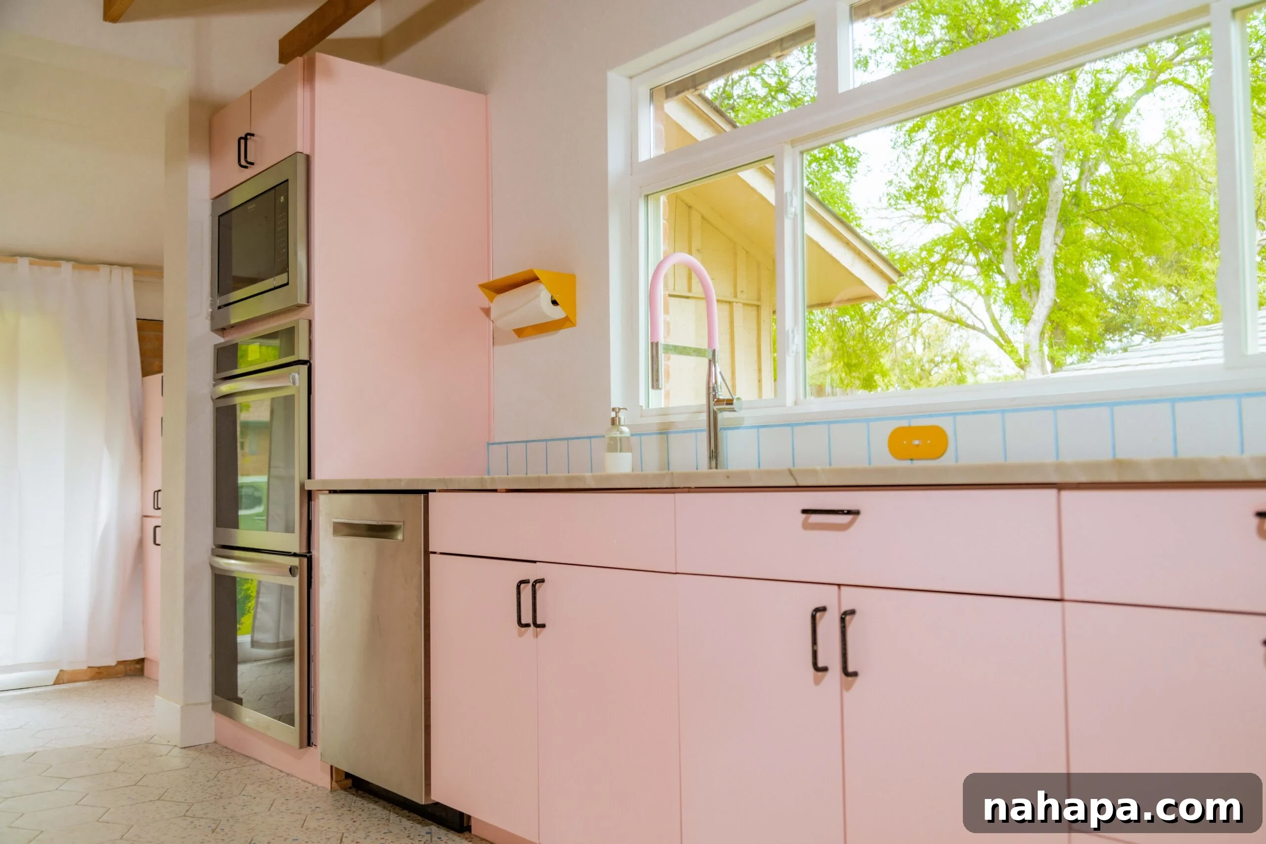
The expansive windows are a game-changer, flooding the kitchen with an abundance of natural light – an absolute necessity for food photography. The seamless integration of modern appliances ensures optimal performance and efficiency, streamlining daily tasks and content creation. Our pink kitchen is more than just a renovation; it’s a vibrant expression of our personal style and a high-performing professional studio.
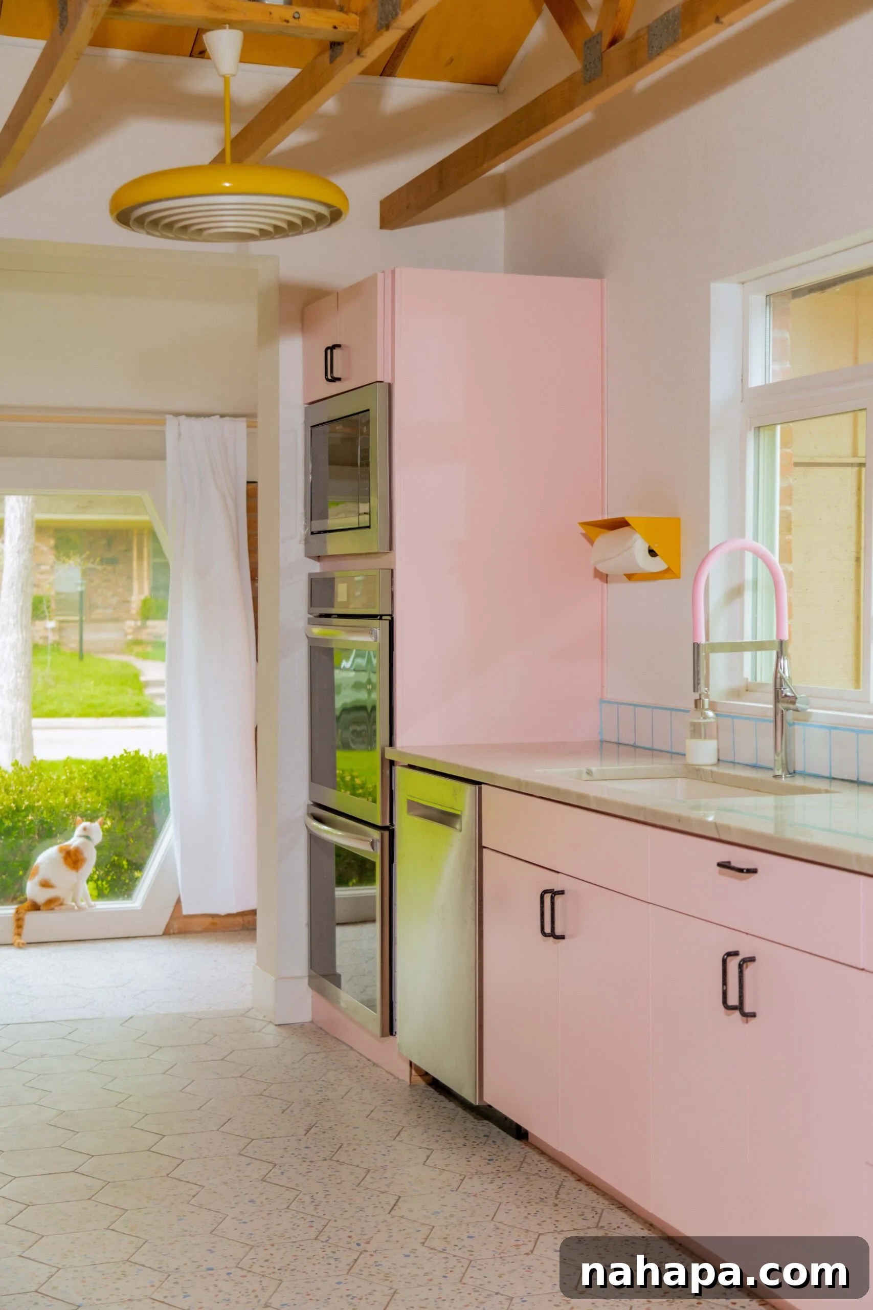
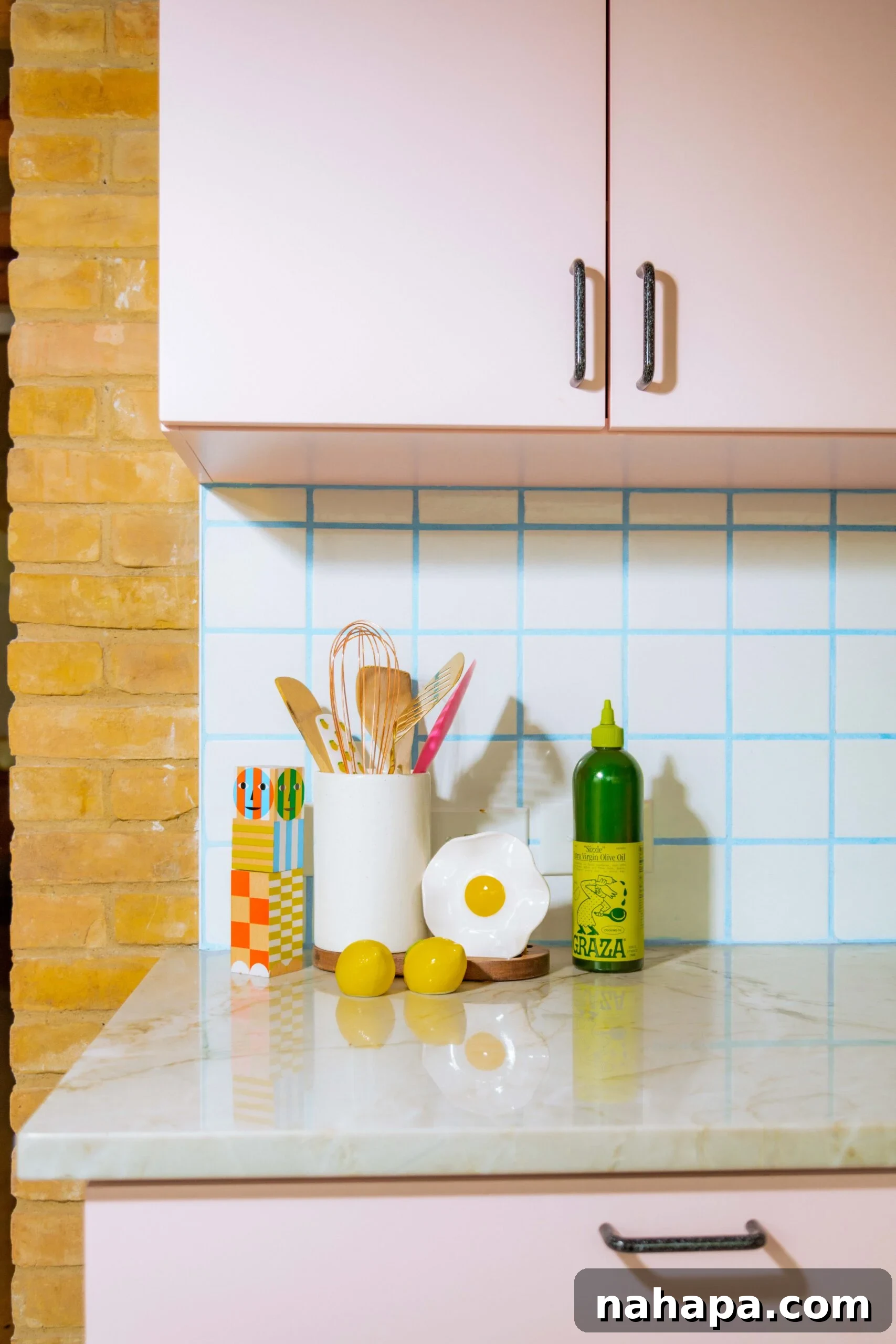
Every detail, from the carefully selected hardware to the unique decorative elements, contributes to the overall mid-century modern aesthetic. The playful pink is balanced by the natural textures of wood and the clean lines of the appliances, creating a harmonious and inviting atmosphere that feels both retro and current. This kitchen is a true reflection of our passion for design and functional living.
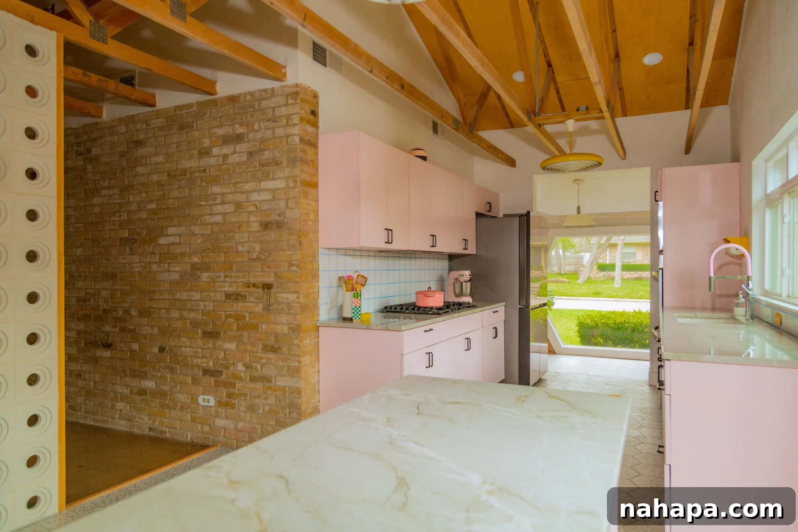
The island, a central feature of the new layout, not only offers additional counter space but also serves as a strategic storage solution, keeping my most-used photography props and equipment within easy reach. This thoughtful design minimizes clutter in the main workspace and maximizes efficiency, truly elevating the kitchen’s functionality for a food blogger.
The terrazzo hexagon tile flooring is one of our favorite elements, providing a subtle nod to the mid-century era while tying in beautifully with the pink cabinetry and overall color scheme. It’s durable, stylish, and adds a unique textural element that enhances the kitchen’s distinctive personality. This flooring choice was a happy accident that elevated the design beyond our initial expectations.
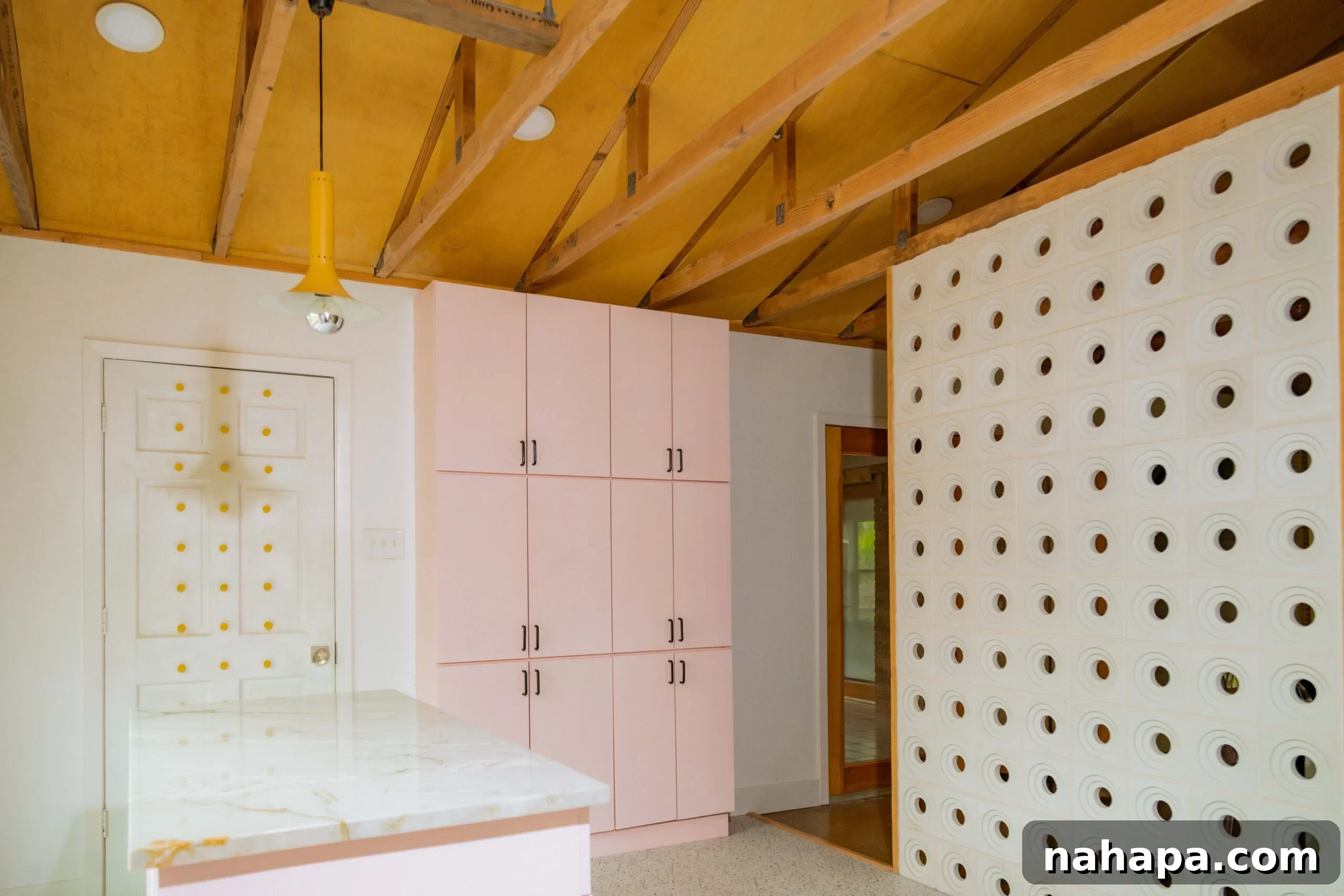
The seamless transition from the kitchen to the dining area creates an open-concept flow perfect for entertaining and family life. The breezeblock wall, a stylish and functional divider, allows for light and visual connection while still delineating separate zones. This design fosters a sense of openness and airiness throughout the primary living spaces, epitomizing modern living.
The Pantry: A Hidden Gem of Functionality and Charm
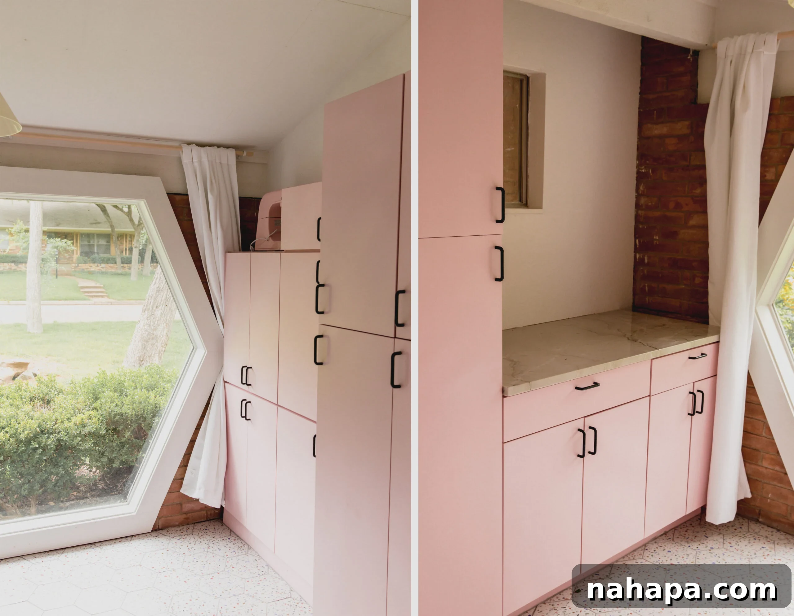
One of the most ingenious transformations in our home involved the pantry, which originally served as the laundry room. It was common for houses of this vintage to have laundry facilities either within or directly adjacent to the kitchen, often creating an awkward layout. Our solution was to relocate the washer/dryer hookup to a more appropriate space in the bathroom, allowing us to convert the former laundry room into a dream pantry. This strategic move not only optimized the kitchen’s footprint but also created a dedicated, organized storage area that is invaluable for a food blogger.
Honestly, the pantry holds a truly special place in our hearts, primarily because it’s home to the original hexagon window. This unique architectural feature was, in fact, what initially sold us on the house! Its distinctive shape and mid-century charm were so captivating that we decided to echo its design by adding a second hexagon window in the living room, creating a cohesive design narrative throughout the house. The pantry, with its ample shelving and thoughtful layout, now efficiently stores everything from bulk ingredients to seldom-used kitchen gadgets, keeping our main kitchen counters pristine and clutter-free.
In a bold move that has proven to be incredibly practical, we consciously sacrificed some potential shelving space within the pantry to incorporate an open counter area. This dedicated counter serves a singular, brilliant purpose: housing larger appliances like the slow cooker or Instant Pot. I always found it frustrating how much valuable counter space these appliances would occupy in the main kitchen for hours on end. Now, they can discreetly work their magic in the pantry, keeping the kitchen island and countertops entirely free for active cooking and food preparation. This small design tweak has yielded a huge win in terms of kitchen functionality and flow, offering a dedicated “appliance garage” that enhances both aesthetics and utility.
Food Blogger Upgrades: Designing for Culinary Creativity
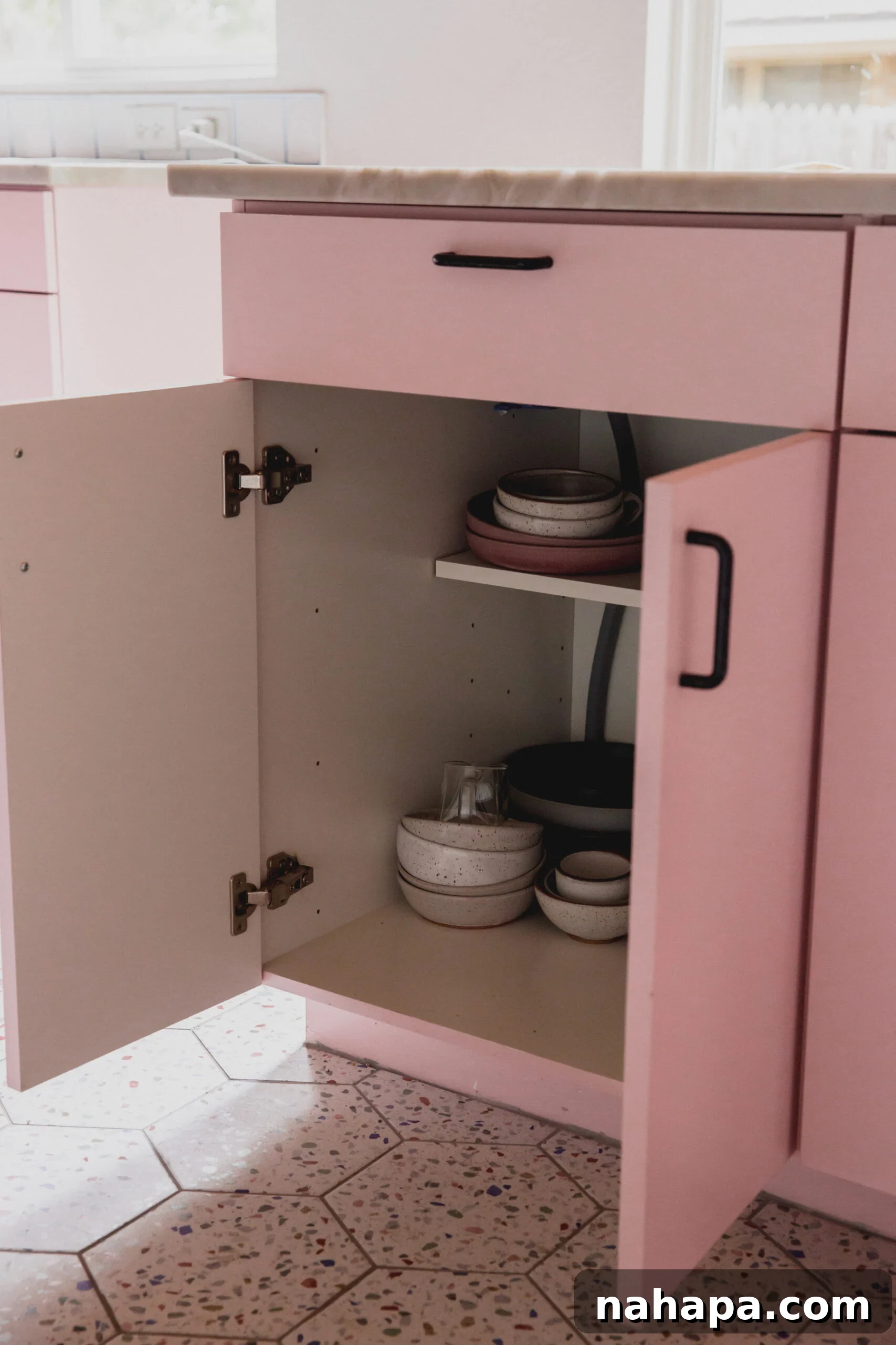
Our previous kitchen was a typical galley kitchen, complete with a small breakfast nook – a layout that felt restrictive and lacked the expansive workspace a food blogger requires. To address this, we completely reconfigured the space, transforming the old breakfast nook area into a dynamic kitchen island with integrated extra storage. This strategic redesign not only elongated the kitchen visually but, more importantly, provided invaluable additional prep surface and intelligent storage solutions, making the kitchen far more conducive to content creation.
The island itself is a marvel of efficiency, featuring two spacious cabinets and several drawers. This isn’t just for general storage; it’s specifically designed to house all of my most frequently used photography props and essential equipment. Having everything right at hand when I’m ready to shoot is incredibly convenient, drastically cutting down on setup time and making my workflow smoother. In my previous kitchen, all these props were scattered in a totally different room, creating a cumbersome back-and-forth that hampered my creative process. This dedicated island storage has been a game-changer for my food blogging business.
Beyond the structural changes, several of our appliance choices were specifically made with my food blogging needs in mind. Our double oven, for instance, provides unparalleled flexibility for baking and roasting multiple dishes simultaneously, a common requirement for recipe development and batch cooking. Similarly, investing in a truly efficient dishwasher was a non-negotiable. It handles the constant flow of dishes and props that come with daily cooking and photography, making cleanup a breeze. And of course, the biggest and most critical upgrade involved the windows. Natural light is absolutely paramount for my preferred style of food photography, which relies on bright, airy visuals. We replaced two of the original, smaller windows with significantly larger ones, deliberately flooding the kitchen with an abundance of natural light. This ensures optimal lighting conditions for every shoot, eliminating the need for artificial lighting in most scenarios and elevating the quality of my content significantly.
FAQs: Your Questions Answered on Our Mid-Century Modern Pink Kitchen Remodel
Where do we live?
We are happily settled in the Dallas/Fort Worth, Texas area. While it might not be as widely recognized for mid-century modern architecture as, say, Palm Springs, DFW actually boasts several delightful pockets of incredible MCM homes. We dedicated considerable time to our search and truly believe we’ve made the absolute best of the unique architectural treasures available in our local market, finding a home that perfectly suited our vision for a vibrant, character-filled renovation.
How long did it take?
Our renovation journey was an extensive one. We officially commenced demolition during the first week of July 2022, and it wasn’t until January 2023 that we were finally able to move into our transformed home. It’s important to note that our project extended far beyond just the kitchen. We undertook a comprehensive overhaul, which included redoing all the flooring throughout the house, performing extensive mold remediation, and replacing all the walls. It was undeniably a huge undertaking, requiring significant time and effort. We were incredibly fortunate to have the flexibility to stay in our previous house during the entire renovation period, which alleviated much of the stress and allowed the work to proceed without interruption.
Who was our designer and contractor?
For the execution of the renovation, we partnered with DFW Landlord Services as our contractor, and they truly did an excellent job bringing our vision to life. As for the design, we took on that creative challenge ourselves! We didn’t hire an external designer, preferring to infuse our personal tastes and ideas into every detail. This hands-on approach to design was a mixed bag, offering both incredible satisfaction from seeing our specific ideas realized, but also presenting its own set of unique challenges and decisions along the way 😆. It was a learning experience, but ultimately, the result is a home that is uniquely ‘us.’
How much did it cost?
Let’s be upfront: a renovation of this scope and detail was certainly not cheap 🤣. However, our financial strategy was somewhat unique. We acquired this house in its original, untouched state, which meant our initial mortgage and closing costs were significantly lower compared to buying a pre-renovated property. We were also incredibly lucky to have entered the real estate market early, back in 2015, when home values were considerably lower. We initially purchased a starter home that was less than 1,000 square feet. By the time we decided to sell that very first home, its value had appreciated substantially, providing us with significant equity that we were able to leverage to finance this larger remodel. We view this project not just as a home improvement, but as a dual investment: both in the future resale value of the property and, crucially, in my business. This isn’t just our family kitchen; it’s my dedicated workspace, a crucial asset for my food blogging career.
Did we DIY anything?
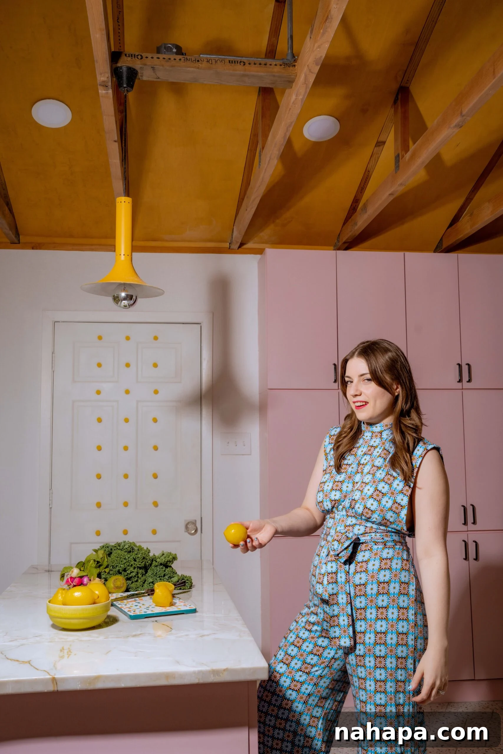
While we undertook several DIY projects in other areas of the house, the kitchen itself mostly involved professional trades due to the complexity and scale of the work. However, there is one particularly fun and personal touch that was a true DIY effort in the kitchen area: the door leading to the laundry room/bathroom, adorned with cheerful yellow pegs. My husband meticulously crafted that himself, and it adds such a delightful, custom, and playful element to the space. I absolutely love it; it’s a small detail that brings a lot of personality!
Any regrets?
Even in a dream kitchen, there are always a few minor points that stand out in hindsight. I do have two significant “regrets” about this kitchen, though one turned out to be a blessing in disguise.
My first regret involved the initial flooring choice. We originally planned for concrete floors throughout the entire first floor of the house, including the kitchen. The vision was a sleek, light grey concrete that would lend an industrial, minimalist edge to the kitchen’s mid-century modern aesthetic. However, the concrete ultimately cured to a completely different shade – a rather deep, earthy brown. This unexpected color drastically darkened the entire kitchen and clashed significantly with the vibrant pink and other carefully chosen elements. I truly disliked how it disrupted the harmonious palette. Thankfully, this turned into the best happy accident: we decided to cover the concrete with the beautiful terrazzo hexagon tile. This tile not only introduced a much-needed pattern and texture but also perfectly complemented the existing colors and the original hexagon window, ultimately bringing the entire kitchen together in a way the grey concrete never would have. It was an unplanned pivot that yielded a far superior aesthetic outcome.
The second regret is a practical one that we still need to address. We installed the range hood over the cooktop a couple of inches too low. It’s one of those details that’s easy to overlook during the intense final stages of a renovation, especially since the hood was one of the very last elements to go in. However, its slightly reduced height becomes very noticeable whenever I cook, making me feel like I’m constantly bumping my head. It’s an irritating minor inconvenience in an otherwise perfect space. We will eventually raise it up, but it will undoubtedly be a bit of a pain, as it will necessitate extending the backsplash as well. Nevertheless, it’s a fix that needs to happen for complete comfort and functionality.
Links to Our Appliance and More: Curated Choices for Our Dream Kitchen
Here’s a breakdown of the key elements and resources that brought our pink mid-century modern kitchen to life, from vintage finds to modern appliances:
- Light fixtures were vintage. We sourced all our light fixtures from various vintage shops and online marketplaces. Each piece was a unique find, adding authentic mid-century character and charm to the kitchen. We’d link them if we could, but the thrill of the hunt is part of their story!
- Countertops. Our stunning countertops, made of durable and beautiful quartzite, were sourced from a local supplier here in Dallas/Fort Worth. We chose quartzite for its elegant appearance, reminiscent of marble but with superior durability, perfect for a high-traffic kitchen. Supporting local businesses was a priority for us.
- Cabinets. Our signature pink cabinets were an exercise in smart design. The specific white base cabinets we initially selected were actually discontinued as we were finishing up the project. However, we went with a cheaper, basic, high-quality white cabinet and then professionally painted them pink rather than investing in custom-made pink cabinetry. This approach allowed us to achieve our desired aesthetic at a more budget-friendly cost while still ensuring a premium finish.
- Breezeblocks. Originally, a solid wood-paneled wall awkwardly divided the kitchen and dining room. We tore it down and strategically moved the dividing line back slightly, replacing it with this beautiful breezeblock wall. The open, geometric pattern of the breezeblocks still delineates the space, offering a subtle separation, but crucially, it allows light and air to flow freely, making both rooms feel much more open and connected.
- Floor tile. The terrazzo hexagon tile for our kitchen floor wasn’t the original plan, as mentioned with our “regrets.” The grey concrete didn’t turn out as we’d pictured, so we swiftly pivoted to this stunning tile. It was truly the best decision – the hexagon shape perfectly echoes the original hexagon window in the pantry, and its terrazzo pattern with flecks of color beautifully complements our chosen palette. It’s one of my absolute favorite features in the entire kitchen, adding both style and durability.
- Faucet. This elegant faucet is available in a variety of finishes and colors, but naturally, we opted for the pink version to perfectly match our kitchen’s signature color scheme. It’s a small detail that makes a big impact, tying the design together beautifully and adding a subtle touch of whimsy.
- Dishwasher. After years of dealing with really cheap, unreliable dishwashers that constantly broke down, we decided to invest in quality. We chose this Bosch model based on its consistently excellent reviews for efficiency and reliability. It was absolutely worth the investment; it cleans exceptionally well and operates quietly, making daily kitchen life much smoother.
- Samsung Bespoke Fridge. I absolutely LOVE this refrigerator. It was undeniably a splurge, but one that has proven to be entirely worth every penny. Of course, we got it in a gorgeous rose pink. It’s a 4-door flex model with versatile freezer space, and it is incredibly spacious and thoughtfully designed. If you’re considering this fridge and are on the fence, I wholeheartedly recommend it for its stunning aesthetics and superior functionality.
- Gas Cooktop. I know gas cooktops have been under scrutiny lately, but I am extremely particular about cooking with gas. I’ve experimented with electric and induction cooktops, but for me, nothing compares to the precise control and immediate heat response that gas provides. This Whirlpool 36-inch model with 5 burners is a professional-grade workhorse that meets all my culinary demands.
- Microwave. We opted for a sleek built-in microwave that integrates seamlessly into the cabinetry, maintaining the clean lines of our mid-century modern design.
- Double oven. This Frigidaire Gallery 30-inch double electric wall oven has been an absolute godsend for my food blogging. The double oven functionality allows for simultaneous baking and roasting at different temperatures, and the integrated air fryer setting has proven to be incredibly handy for healthier, crispy results.
- Outlet Covers. Even small details matter! We chose these unique pill-shaped outlet covers to add a subtle, modern, and playful touch, ensuring every element in the kitchen contributes to the overall aesthetic.
- Paper towel holder. We selected a minimalist and functional paper towel holder that blends seamlessly with our kitchen’s sleek design, providing convenience without compromising on style.
The captivating “after” PHOTOS in this blog post are expertly captured by Emilee Prado, while the humble “before” images are my own candid shots 😆.